Extras Landing Page
Brief
The Extras Landing Page (ELP) brings together all of an event's Extras into a single page, letting users purchase multiple items in one transaction. Users can be guided here via email or My Account to pick up anything they skipped over during their original ticket purchase.
As Lead Product Designer for the Ancillary Revenue team, I was tasked with redesigning the ELP. The goal of the project was to unlock the ability to offer a wider range of extras and merchandise all offers more effectively, increasing conversion through new cross-sell opportunities.
Old page
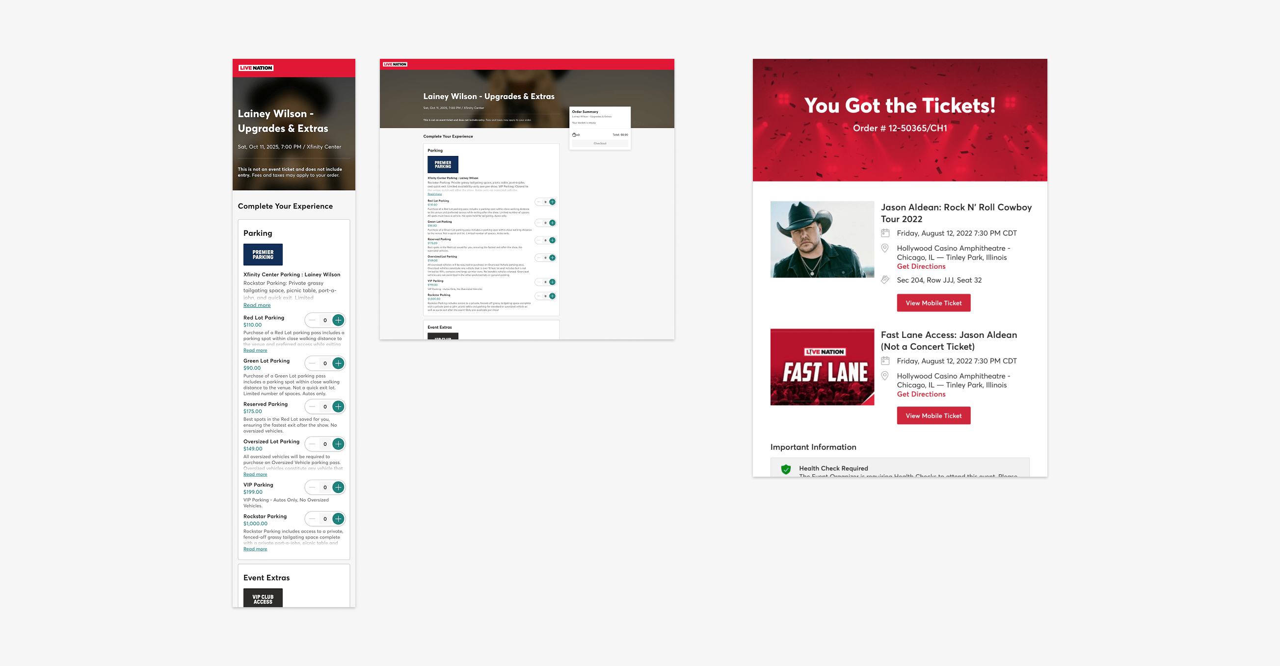
The old ELP showed all available options for each extra together by default, making the page long and hard to scan. Descriptions were hidden behind "Read more" links, so comparing two options meant several clicks back and forth rather than a quick glance. Each extra was represented by a single small thumbnail, which did little to sell a piece of merchandise and made it hard to make out something like a parking map, where the image itself carried information a user actually needed before buying.
Alongside the page, I was also tasked with redesigning the confirmation emails for orders containing extras, both with and without an accompanying ticket. The old emails simply reused the standard ticket confirmation template regardless of what had actually been purchased. An order for something like a Fast Lane pass on its own would arrive formatted as if the user had bought event tickets, which caused confusion for users trying to work out what they'd actually purchased.
Kick off
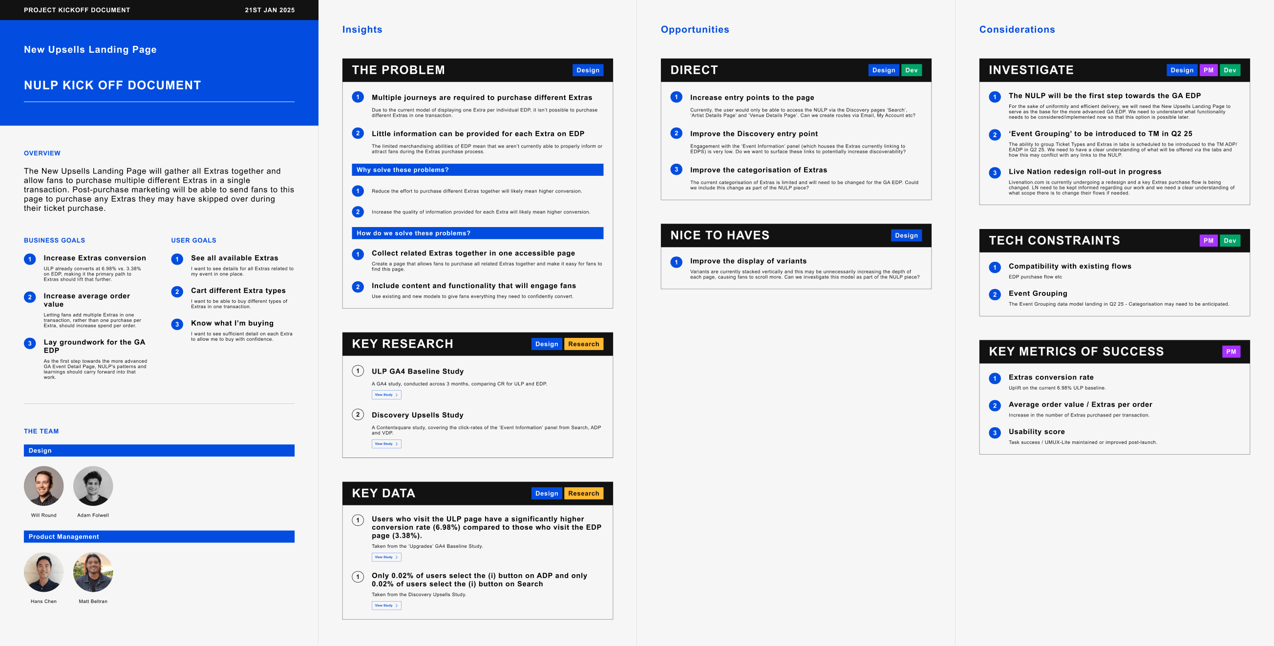
I kicked off the project by working alongside members of the Product Management team to create a short document covering the key goals, insights, opportunities and considerations for the work.
As well as via the old ELP, users could purchase extras on another page called the Event Details Page, or EDP. The EDP was built for the sale of tickets rather than extras though, and only allowed a single type of extra to be purchased per transaction. Despite these UX issues, Ticketmaster's clients were still more widely adopting the EDP for the sale of extras over the ELP. Google Analytics showed that the old ELP already converted at almost double the EDP's rate. This made a strong commercial case for consolidating more of the extras purchase journey into a single, redesigned page.

This board maps the user's Jobs To Be Done for purchasing an extra after buying a ticket. I created the board to investigate the Discovery, Purchase, Management and Use stages of the user's journey, and identify the underlying questions, pain points and opportunities. These findings served as a constant reference point throughout the design process.
Research
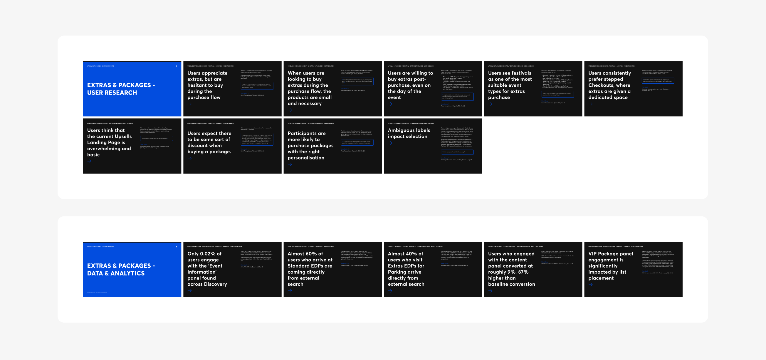
Before jumping into wireframes, I pulled together all the relevant research that I and other members of the Design team had previously conducted, covering both user research and data. This helped ground the redesign in what we already knew, rather than starting from a blank page.
Two findings stood out. Users consistently found the old ELP overwhelming. Engagement with one of the EDP's purchase journeys was almost nonexistent, at just 0.02%. Together, these pointed to the same conclusion. The ELP needed to be revised, and the failing EDP journey needed to be replaced with a more direct route into the new ELP.
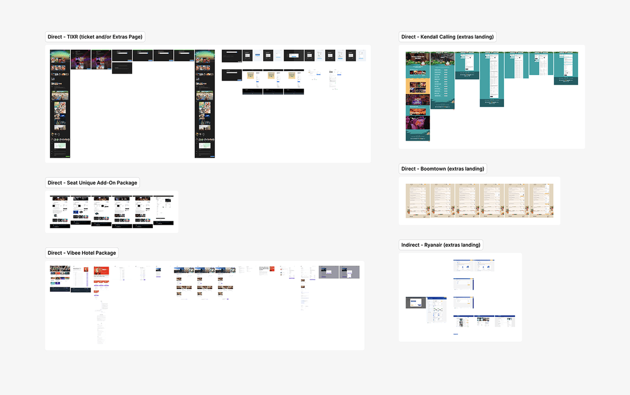
Alongside internal research, I looked at how competitors were presenting extras as their own dedicated page or flow. The strongest examples combined concise information with good visual appeal to create a lean but compelling experience.
Initial designs
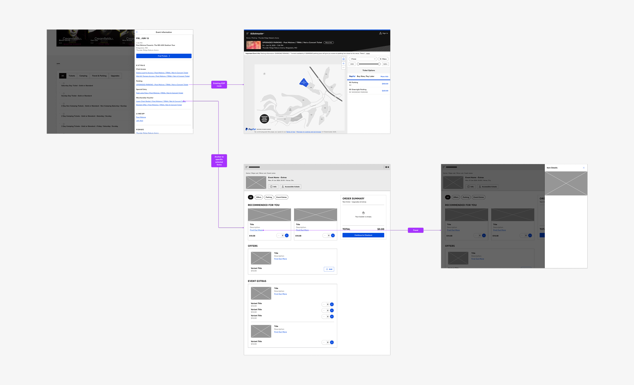
This early wireframe was used to illustrate a basic layout for the ELP and a proposed path for how a user would actually arrive at the page. Moving extras from the EDP to the ELP would be a gradual process, meaning the two pages would need to work together during the transition. The flow above shows how each link from a discovery page would send the user to either the EDP for that individual extra, or the consolidated ELP with its potential for cross-sell. I proposed that the links leading to the ELP would anchor straight to the user's chosen extra, rather than to the top of the list.
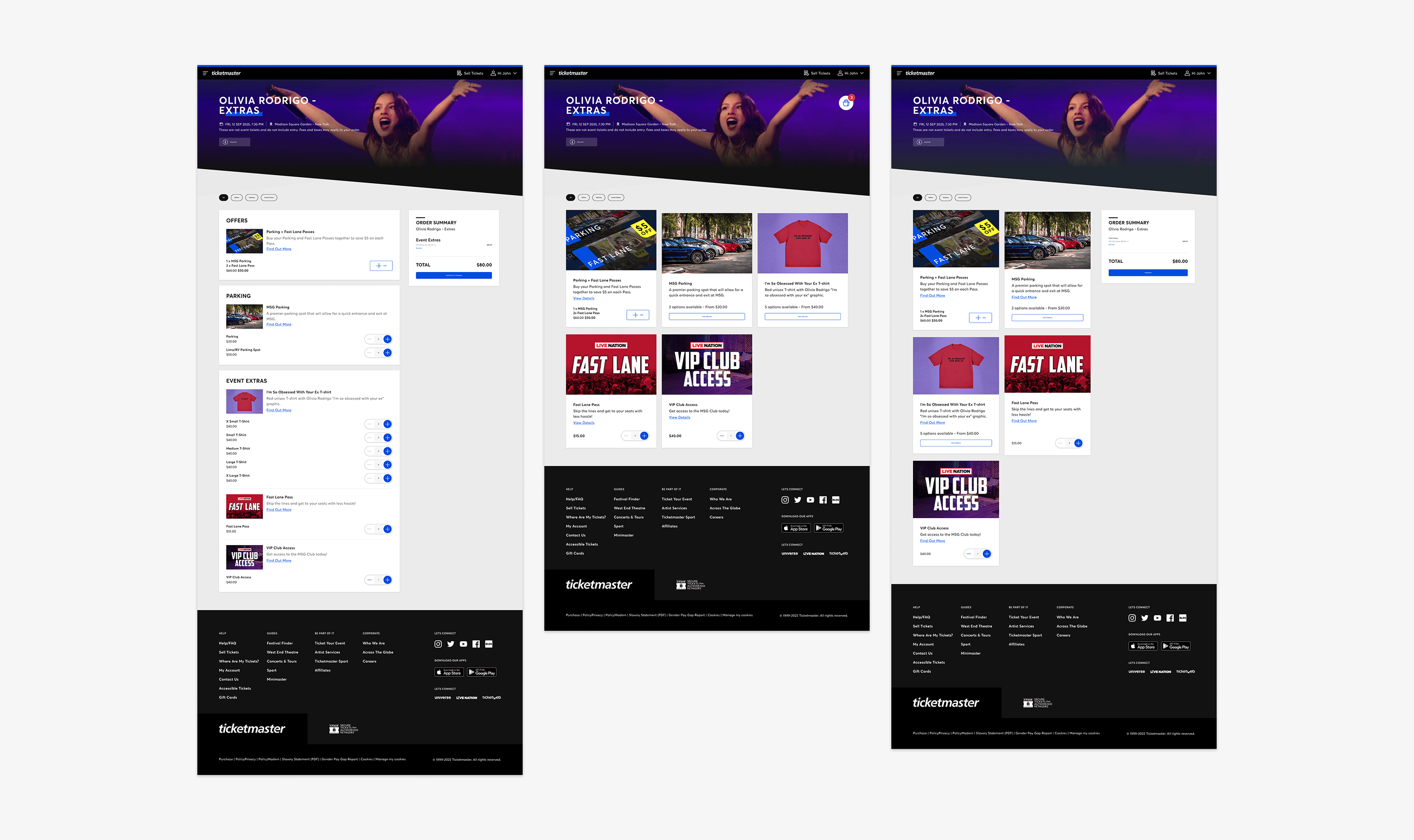
These three designs illustrate the layout options considered for the new page: the old page's horizontal list with a fixed cart, a full-width version with a floating cart, and a vertical list with a fixed cart. Option 3 was chosen to be developed further as I and the wider team felt it balanced good visual appeal with the right amount of space for what can be a variable quantity of extras. It should be noted that options 2 and 3 mark the point where I first proposed that all options for each extra, such as the parking lot options for a parking extra, should be displayed and selected within a panel, not the main page.
Testing
To validate the new ELP and identify where it still needed work, I ran two rounds of unmoderated usability testing via Usertesting.com. These tests consisted of 12 US-based users per round, split evenly across mobile and desktop.
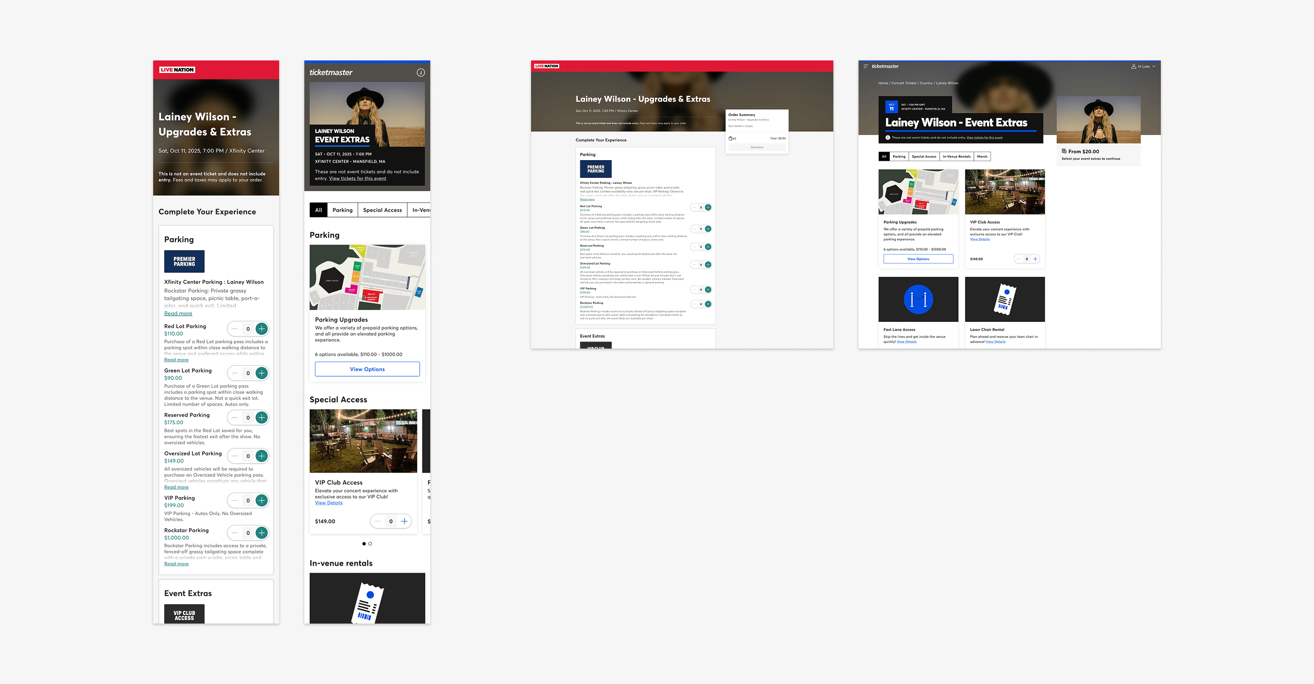
Round 1 - New ELP vs. Old ELP
The first round benchmarked the new ELP against the old page, checking whether users could review extras, add and remove single-option and multi-option products, and get a quick overall read on the page.
Users interacted with prototypes of the new and old pages on desktop and mobile, working through the same core tasks on each model so the two could be compared directly.
- 11 of 12 users preferred the new page overall, describing it as more modern and better organised than the old version.
- UMUX-Lite scored 10 points higher on the new page, with the biggest gain on mobile.
- Task completion was broadly comparable, but locating option descriptions behind a tab slowed the multi-option task for the new version and lowered ease-of-use scores on desktop.
- Inconsistent product content, such as imagery, titles and descriptions not matching the map, added friction on both versions.
Following this initial test, I explored alternative ways of presenting the option descriptions beyond a tab and conducted an additional test to validate.
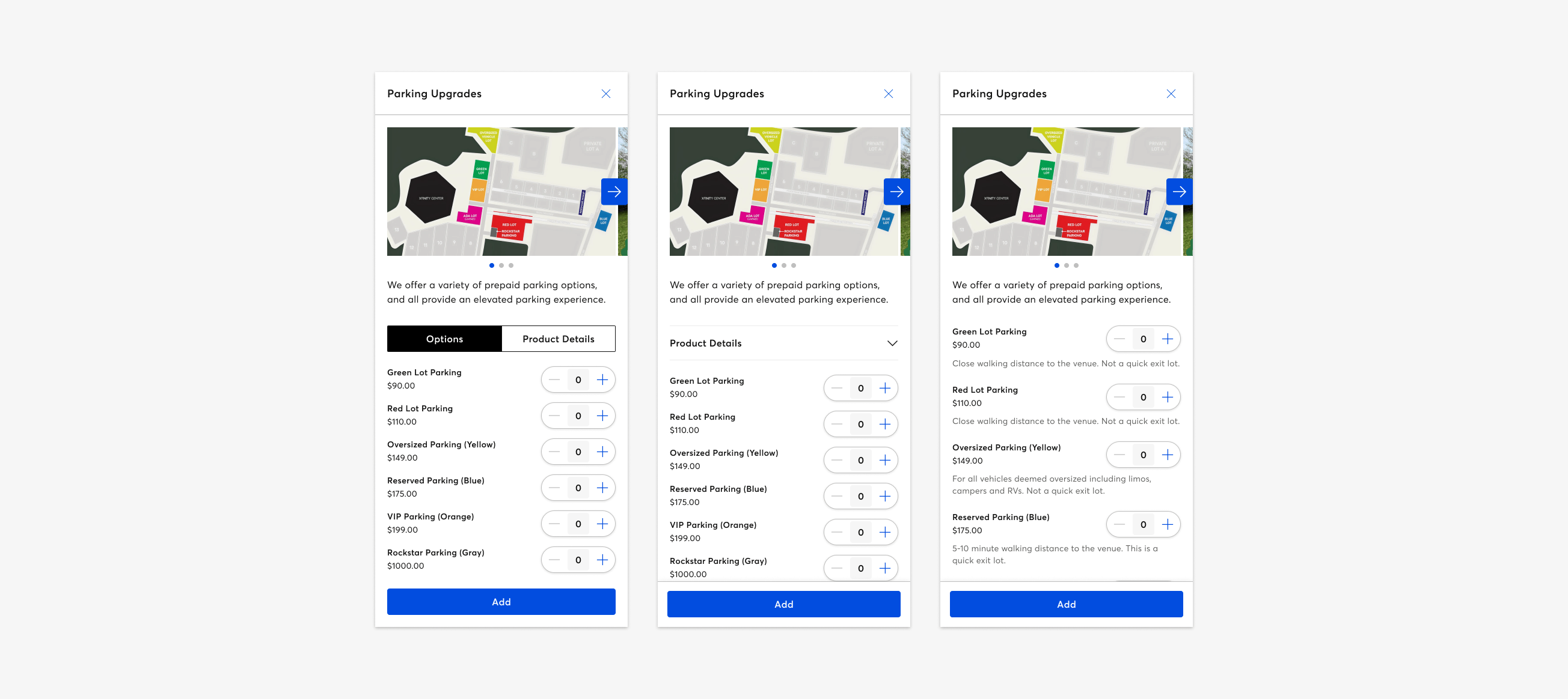
Round 2 - Option description models
In round 2, I tested three ways of presenting the option descriptions for each extra: a tabbed toggle, a collapsible dropdown, and an inline description, which my Engineering team had previously deemed difficult to implement.
Each user worked through the same task across all three models, so preference and ease of use could be compared on a like-for-like basis.
- The inline model was the quickest of the three to complete, comfortably ahead of the tabbed and dropdown versions.
- It scored a near-perfect UMUX-Lite, comfortably ahead of the other two models.
- 11 of 12 users preferred it overall, describing it as more intuitive since it needed no extra navigation to see everything at a glance.
I presented this piece of work to my Engineering team. It proved compelling enough to warrant the extra work to implement.
Velocity
Alongside the human panel, I ran the same core tasks through Velocity, an AI testing tool that simulates a person working through a flow step by step. Velocity completed the core tasks successfully on the new page, with only a few minor suggestions. This served as a good early signal that the new page's structure was sound before testing it with real users.
Final designs
With testing complete, these are the final designs that shipped, refined further and aligned with the visual language of other pages recently developed across the site.
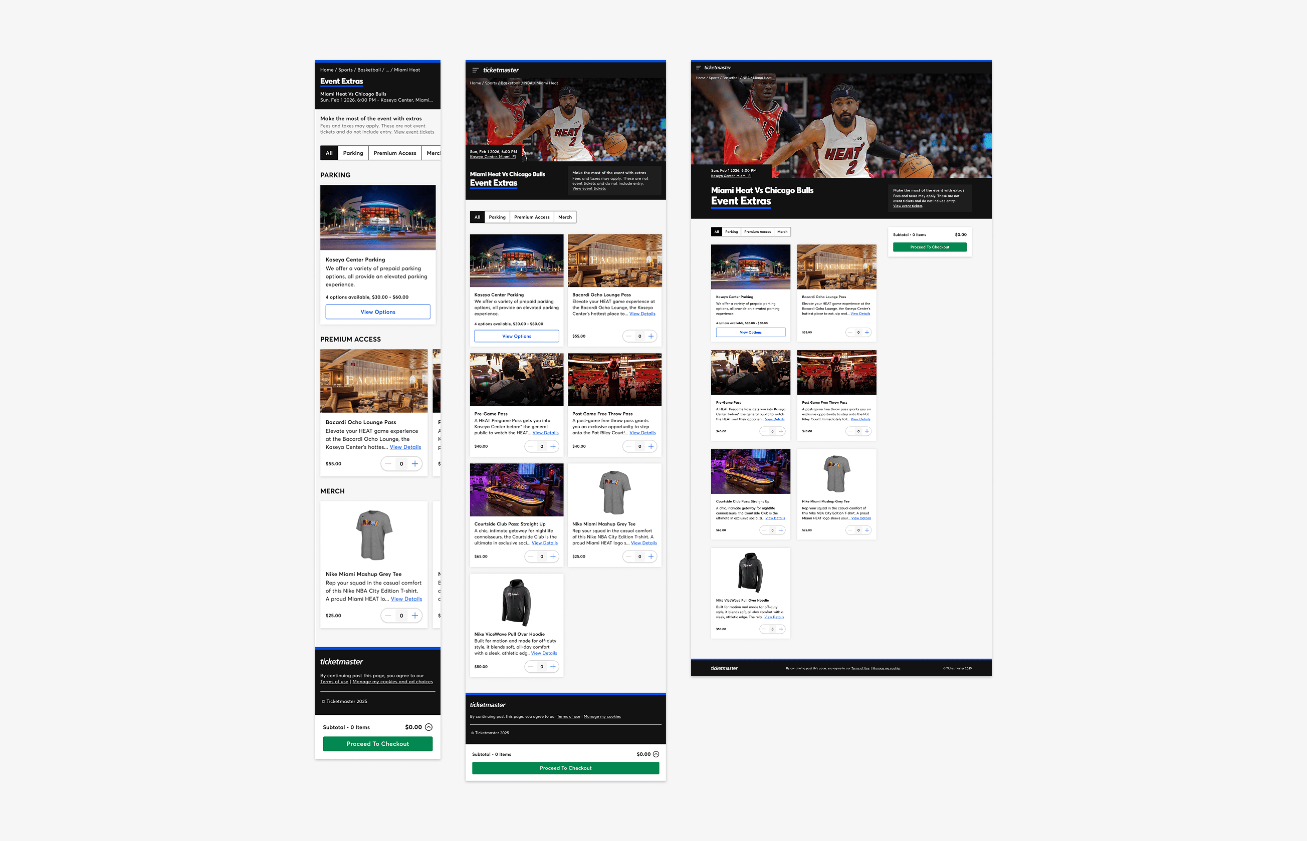
The new ELP presents all extras in a scrollable grid of concise product cards, rather than the old page's stacked list of long panels. Each card carries a quantity stepper for single-option items or a "View Options" button that opens a panel for multi-option products. The new page also includes a set of tags to quickly filter the grid, and space for bold header and item imagery to increase engagement.
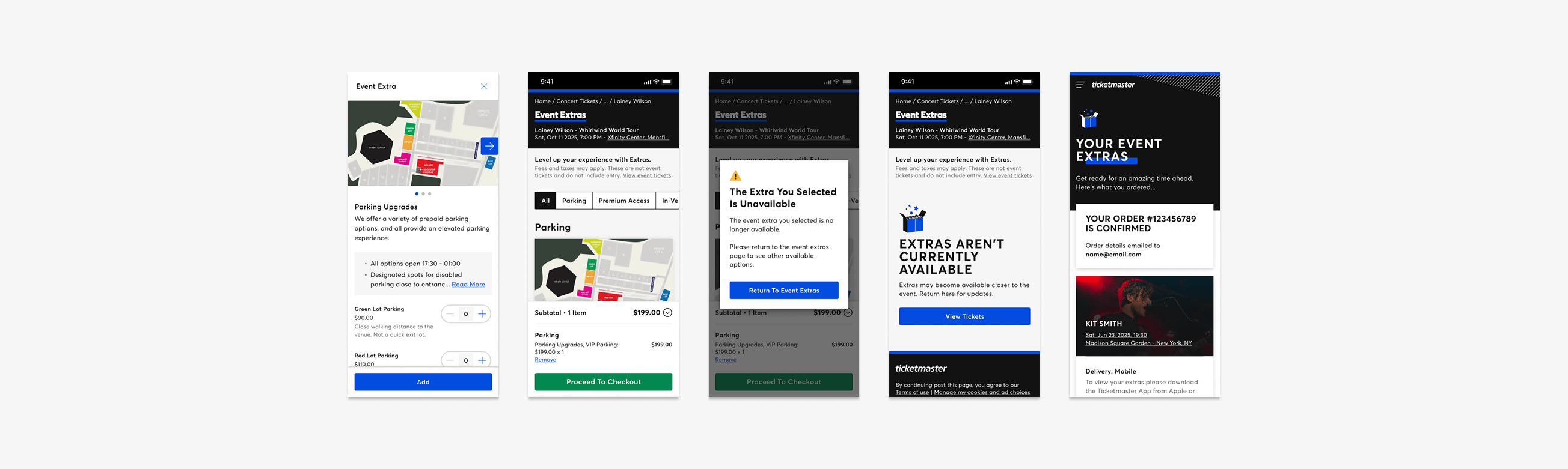
Above are some of the many additional layouts and states created for the ELP launch. These include the item details panel with selectable options and inline option descriptions in place, the sticky cart created for mobile, an error alert, a "no extras available" page state, and a modified confirmation page for extras-only purchases.
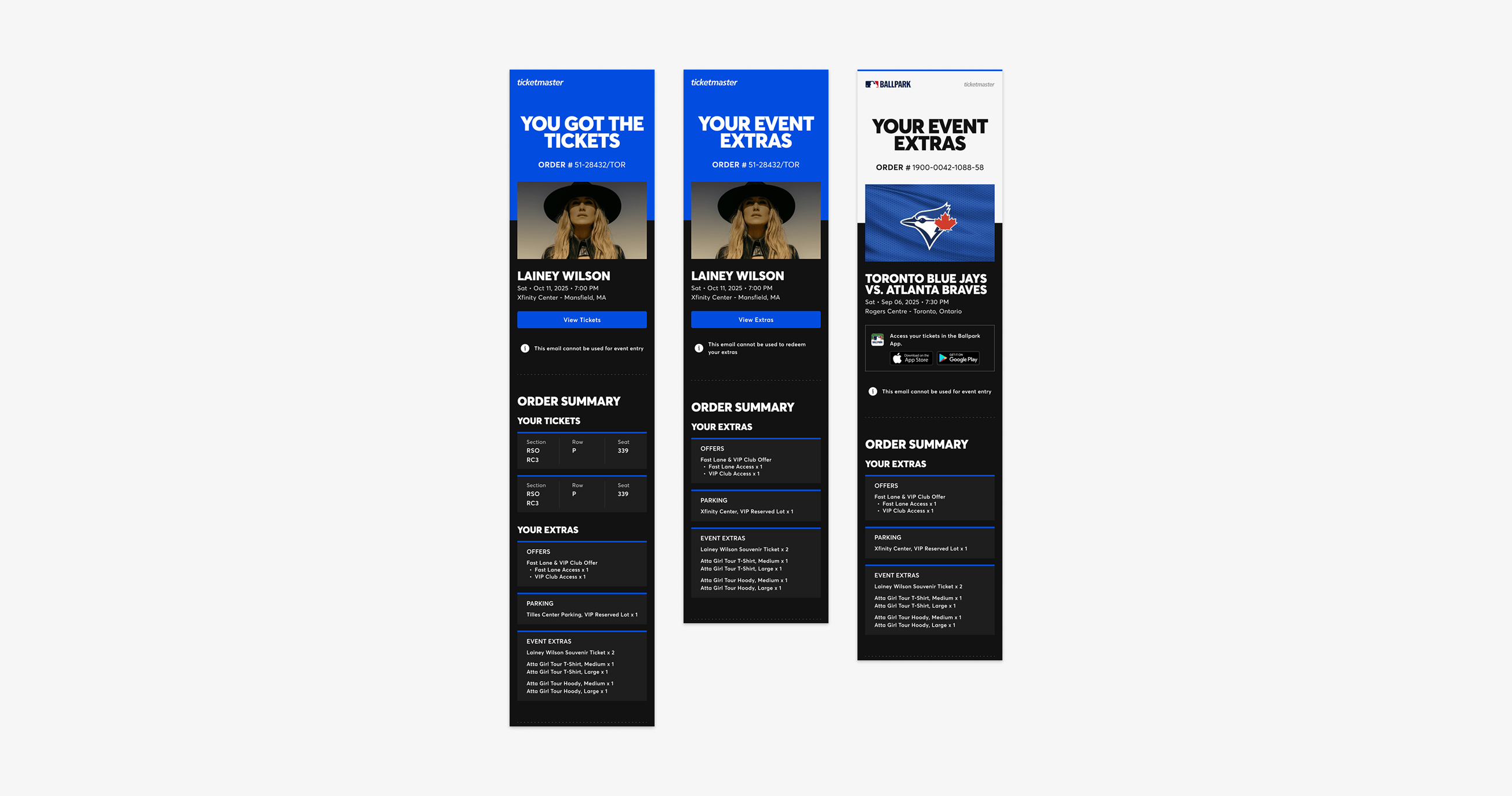
Here are examples of the "ticket + extra," "extra-only," and "cobranded" emails I created as part of the ELP work. The new templates make it clear exactly what extras, options, and quantities have been purchased.
Launch
The new ELP launched in May '26, with traffic increased gradually as part of the phased rollout. The plan from here was to monitor the Key Metrics of Success set out in the kick-off document as traffic grew, working with the Data & Analytics team to track Extras conversion rate, average order value, and usability score against the uplift the business case had predicted. A number of smaller refinements that hadn't made the initial launch scope were also lined up to revisit once real usage data had built up.