Site redesign
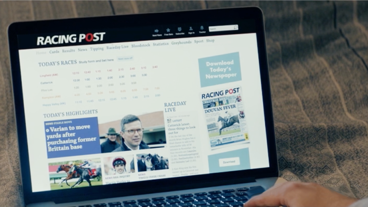
RacingPost.com is the flagship site of Racing Post. The site is considered to be the impartial bible of the horse-racing world and attracts hundreds of thousands of individual users each week. Visitors use the site to access Racing Post's unparalleled breadth of racing expertise and bet with a variety of integrated bookmakers. RacingPost.com can be used for free or users can access additional specialised content by subscribing to the Racing Post Members' Club. The site can be viewed here.
In late 2015 it was decided that RacingPost.com needed to be redesigned from the ground up. At that point, the current site was looking outdated and the user was presented with just one version of the site regardless of whether they were on a desktop computer, tablet or phone. The site crucially needed to be responsively redesigned to give the best possible experience for both users in the home and at the racecourse.
Wireframes
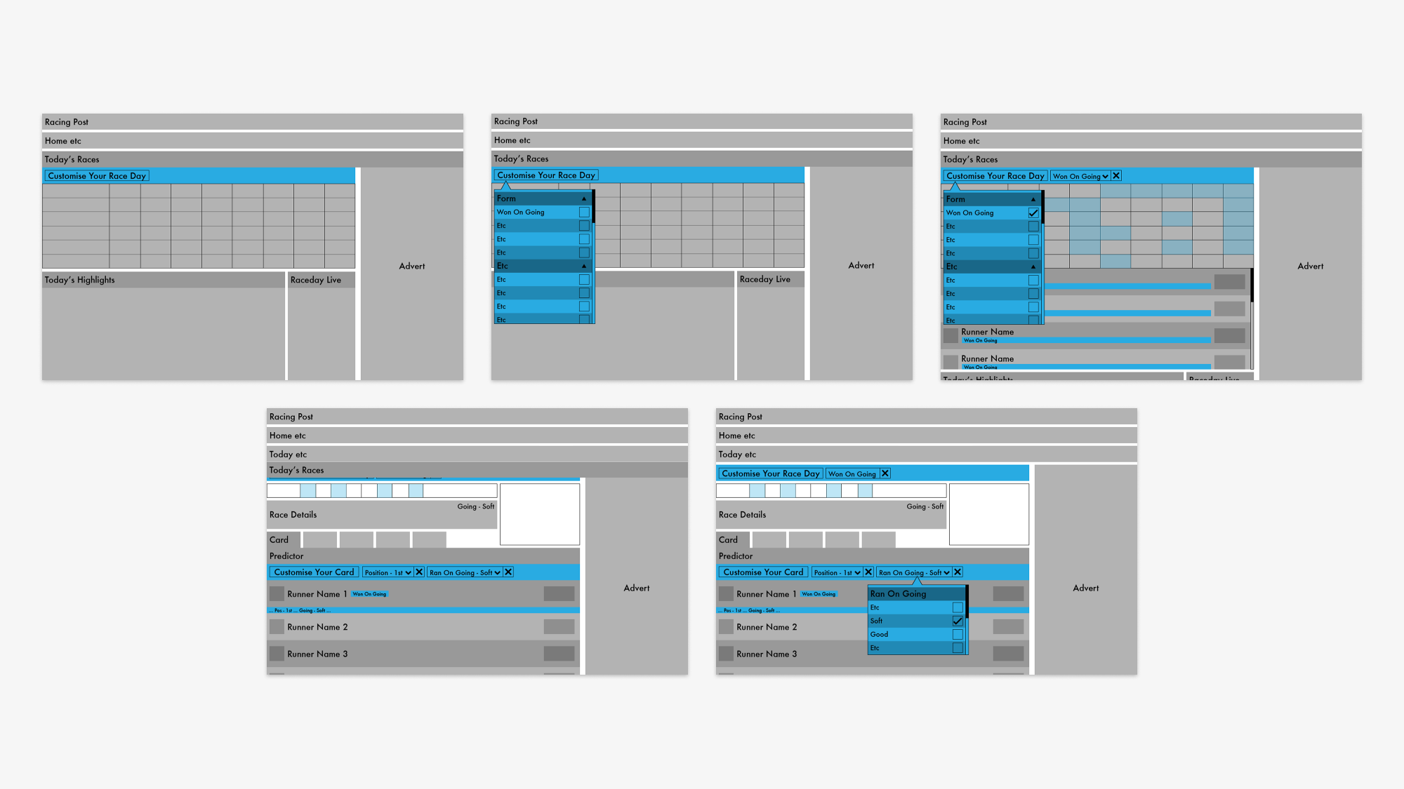
I was tasked with contributing designs for the home page, the race-card page and the bet-slip of the new RacingPost.com, I also created designs for a suite of brand new features. After early discussions with stakeholders were held I created sketches, low-fi wireframes and page-flows to illustrate the design possibilities available. The images above show early wireframes of a new feature introduced to the site, a site-wide filter system created to allow the user to narrow down their options for the race-day ahead. When stakeholders in the company had given their approval to these early wireframes I was able to create full designs of each page ready for testing.
Prototyping
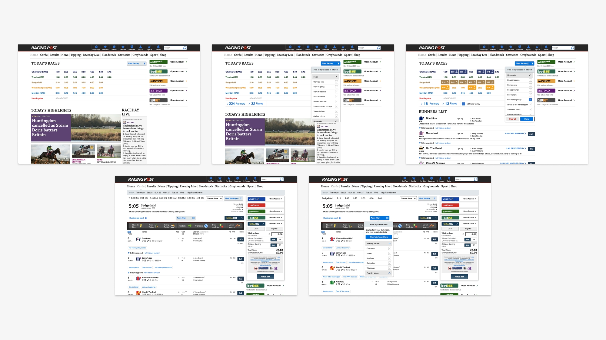
Once full designs were created for each page using Sketch I was able to export the artwork to be used in a prototype. I used the application Axure as it allows a wide range of possibilities when it comes to adding interactivity and complex animation to designs. The designs above were collaboratively created in a sprint week to test how the site-wide filter system could work.
Testing
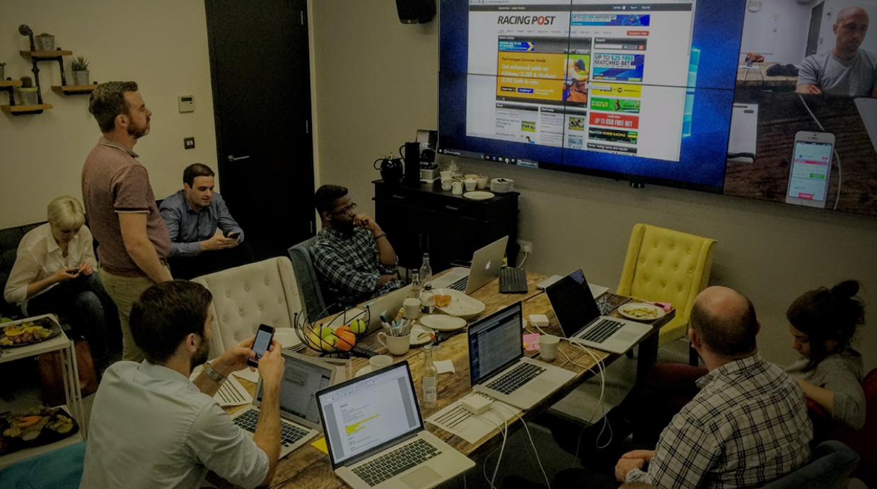
Once each prototype was completed it was taken into a testing session to gauge the success of the proposed design. A member of the Racing Post's audience was invited to interact with the prototype and answer open questions. Over the length of the development of the new RacingPost.com an average of 10 participants interacted with our prototypes each month. Every testing session gave me invaluable qualitative feedback on how to best alter each design for our audience.
Final designs
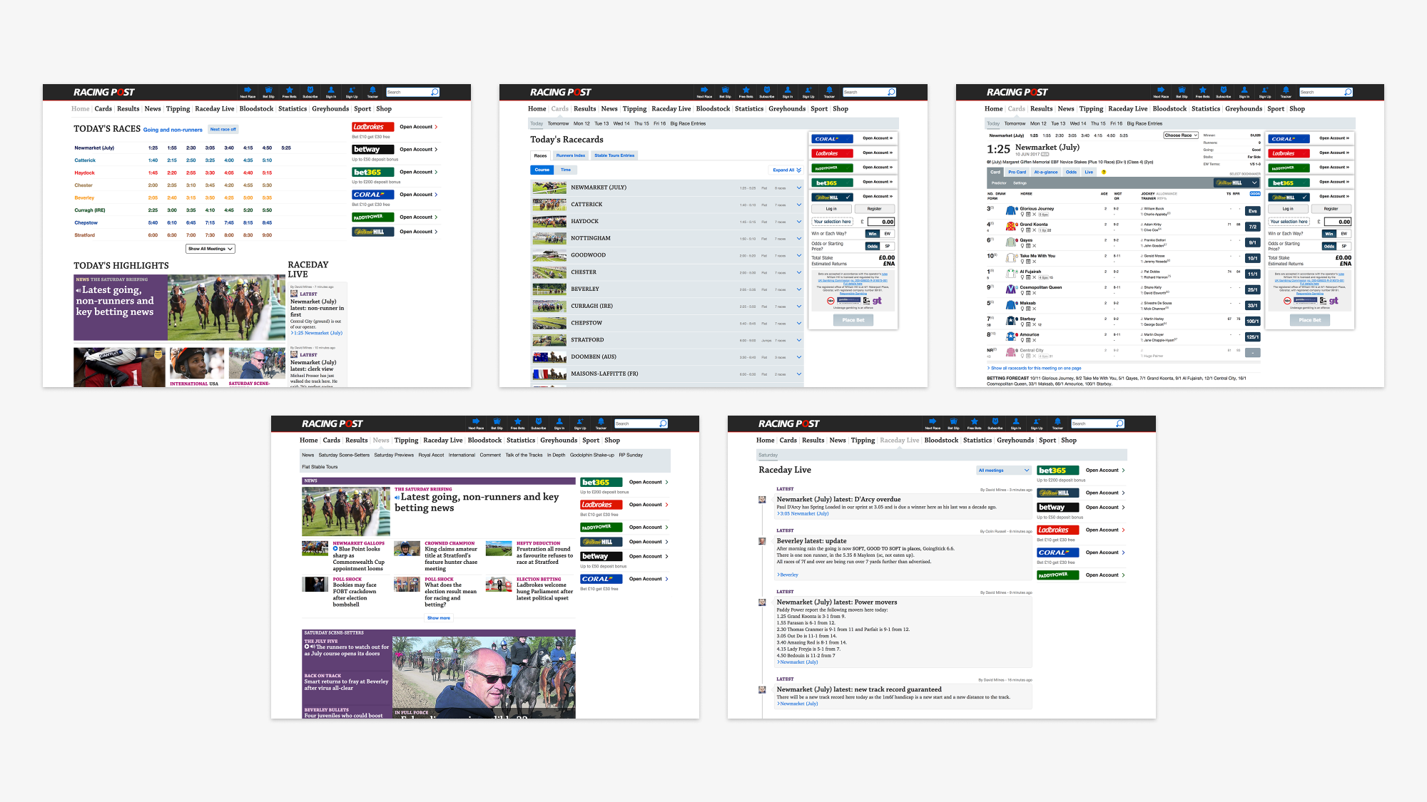
When any last alterations had been made I was able to create the final page designs for the site and spec them for development. Each page design uses an 8 pixel grid system to align content correctly and ensure a sense of continuity across the site. Large sections of each page's content is divided into columns which responsively move position based on the size of the user's device.
A white background was used to give the site a fresher, more modern look and a bright blue was used to clearly highlight interactive elements. As a large section of our users are older and may be visually impaired we used a large default font size to increase legibility and ensure the accessibility of the site. Analytics were used to continually evolve and improve the site after launch.
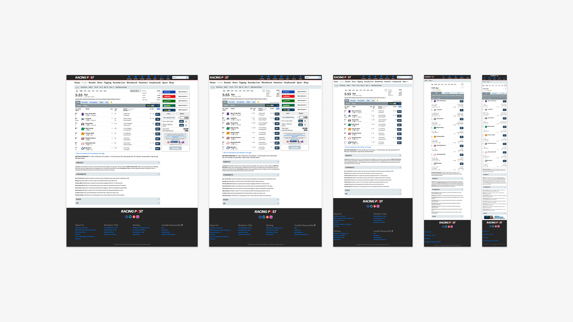
Many users of RacingPost.com view the site whilst out at the racecourse, as such it was imperative that the race-card rearrange itself to always display the most pertinent information even when viewed on a phone. The site responsively alters itself into different configurations based on the user's detected device size and resolution. These 5 configurations can be seen in images above and are 'Extra Wide' for desktop computers, 'Wide' for tablets in landscape mode, 'Medium' for tablets in portrait mode, 'Narrow' for phones in landscape mode and 'Extra Narrow' for phones in portrait mode.
Design system
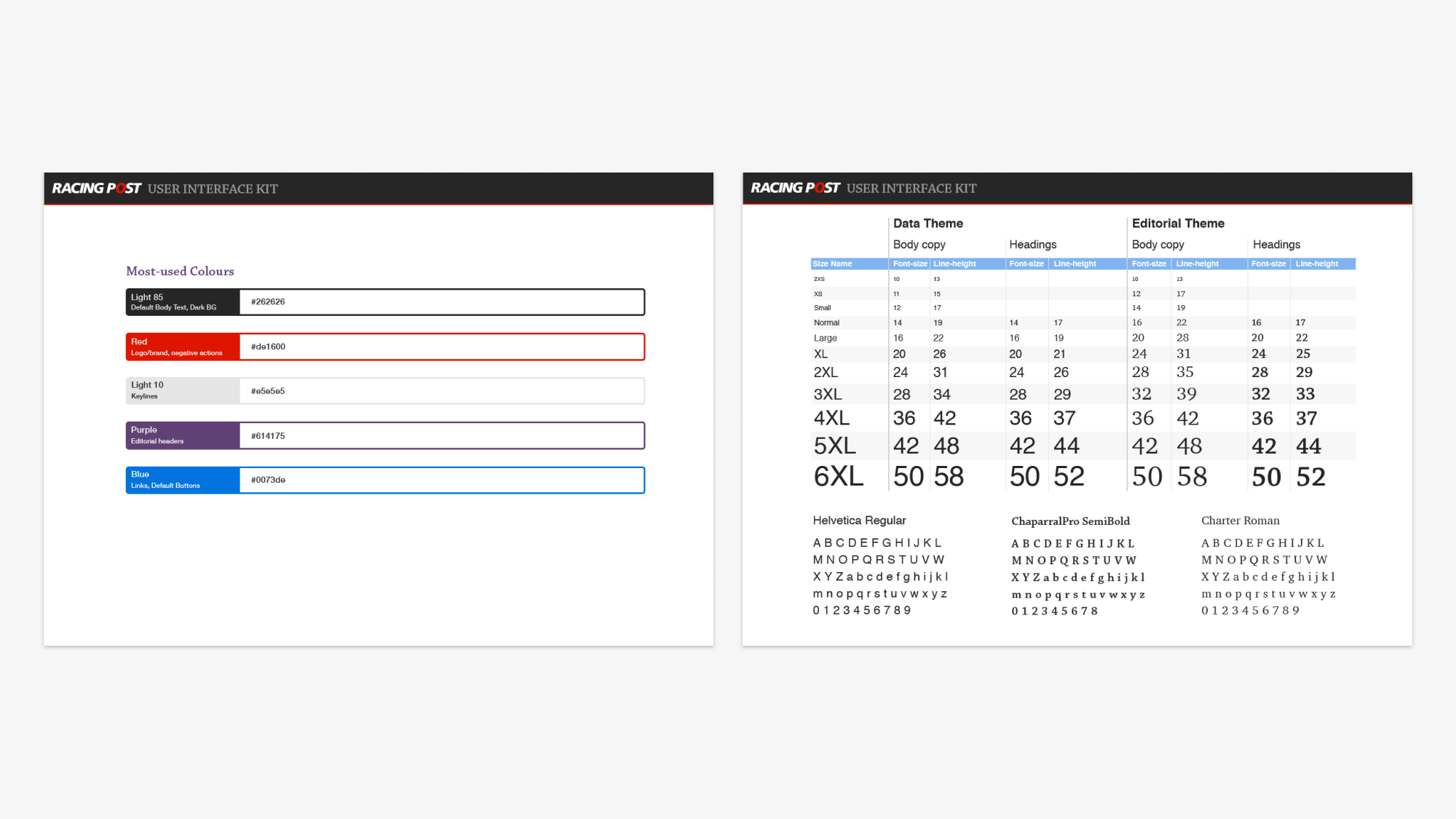
An extensive design system for the redesign was also created by my team and I.
Promotion
Above is one of a series of adverts for the new site, produced by 'Gas&Electric' using on-screen footage created by myself.