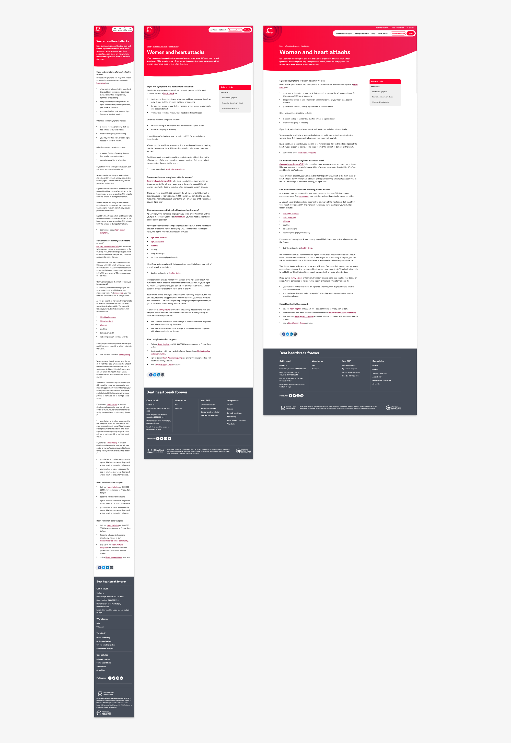
Site redesign
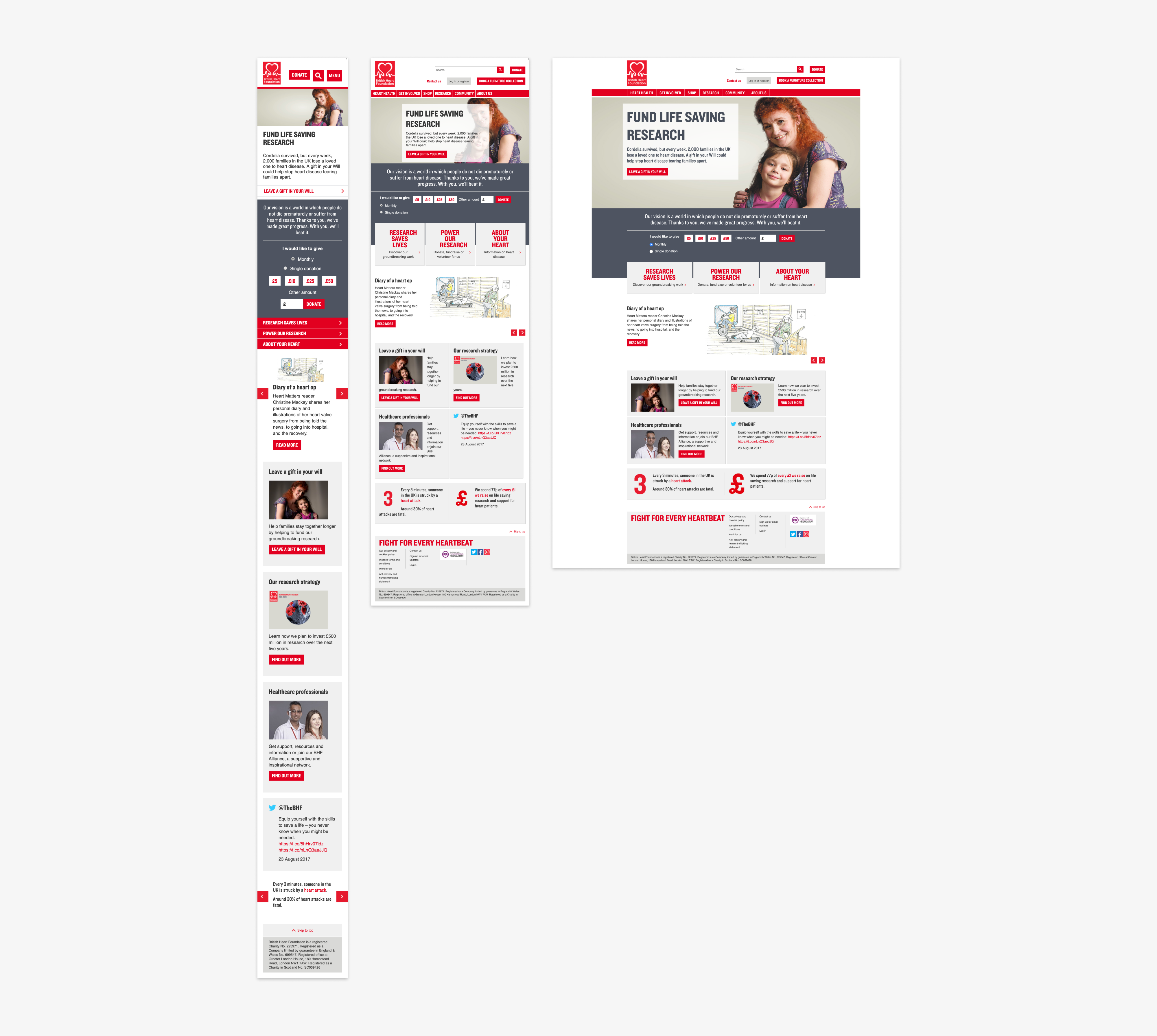
Old site
The initial goal of the bhf.org.uk redesign project was to solve the information architecture issues found across the site. The structure had not been updated for seven years, during which time there have been massive changes to the way people use the web and significant changes to the BHF's activities and strategy. The site had grown without any overarching plan and the language and structure were both too inward-facing, as such a full review was needed and overdue.
Research
The project began with widespread user interviews. These interviews took place to try and ascertain the general user types for which the site now needed to serve. The findings of the interviews meant that eight personas were created and more detailed interviews were conducted with representatives of each of these groups. Alongside this we conducted cardsorting workshops and Treejack tests with both internal and external users to establish a clearer information architecture and navigation system.
Personas
Eight personas, representing the main British Heart Foundation audiences were created for this project, here are two examples.
Russell - Relative of a CVD sufferer

Situation
Russell's dad had a heart attack a couple of months ago. He's recovering now, but he's been told it's a chronic health issue and Russell will need to help him monitor and seek medical help when required. It also gave the family a big scare. When his dad was in hospital Russell was given various leaflets from the BHF, among other organisations. The consultant also told Russell that the BHF would be able to help his dad with ongoing health advice and that he should look at their website. Russell's uncle also has a heart condition too so Russell is beginning to wonder if it's a family link, and what this means for him and his children. He wonders whether there is anything he should be doing now to help him and his family avoid getting heart conditions in future.
Top tasks
Russell wants to help his dad eat more healthily. He searches "healthy eating heart condition" online and finds a section on the BHF website with information about diet and recipe ideas. Although he feels at risk himself he worries his dad's condition is genetic. While on the BHF website for his dad he reads the page about the condition and reads a section on doctors, Russell wonders if this condition will still be an issue when his children are older. He searches online for information about what research is being done and comes across an article on the BHF website about new research.
Karen - Charity shopper

Situation
Karen pops into her local charity shops when she's on the high street, and the BHF is one of these. She's also been to a nearby BHF furniture shop, when her daughter was going to university and needed some cheap furniture. Apart from this, Karen doesn't know much about the BHF - she assumes they help people with heart conditions but that's all she knows. When she's in a charity shop Karen focuses on shopping. She's happy that as a charity the BHF must be doing good. Karen also donates items to her local charity shops whenever she has a clearout at home, and has donated to the BHF shop in the past - she has been swayed by shops appealing for particular items, and if she has something particularly nice she'll usually give it to a shop that looks well-kept. Normally though she donates to whichever shop is easiest to drop her items off at.
Top tasks
Karen is given a BHF collection bag. It reminds her that she wants to clear out some old winter coats, so she puts them in the BHF bag and drops it off next time she's on the high street. Karen's local BHF shop displays information about the research the BHF does and what this means in terms of treatment. As a result Karen feels more informed about how supporting the BHF charity shop leads to positive outcomes.
Wireframes
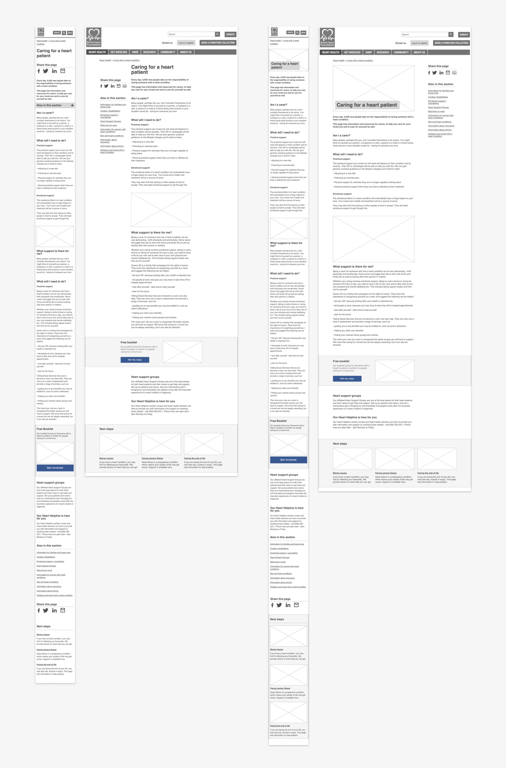
Using findings from the initial research, I created two variations of wireframe layouts for a 'Standard content page'. Long line-length had been identified as an issue of these pages so one of the layouts used a narrower half-width centred text component for more comfortable reading. I also created a new secondary navigation element as research had told us the current menu system was deemed to be "confusing" and "inconsistent". BHF stakeholders had also fed back that they would like more visibility for promotions so 'Related links' and 'Promoted items' components were also added to the page.
Testing round 1 - Initial designs
Set 1
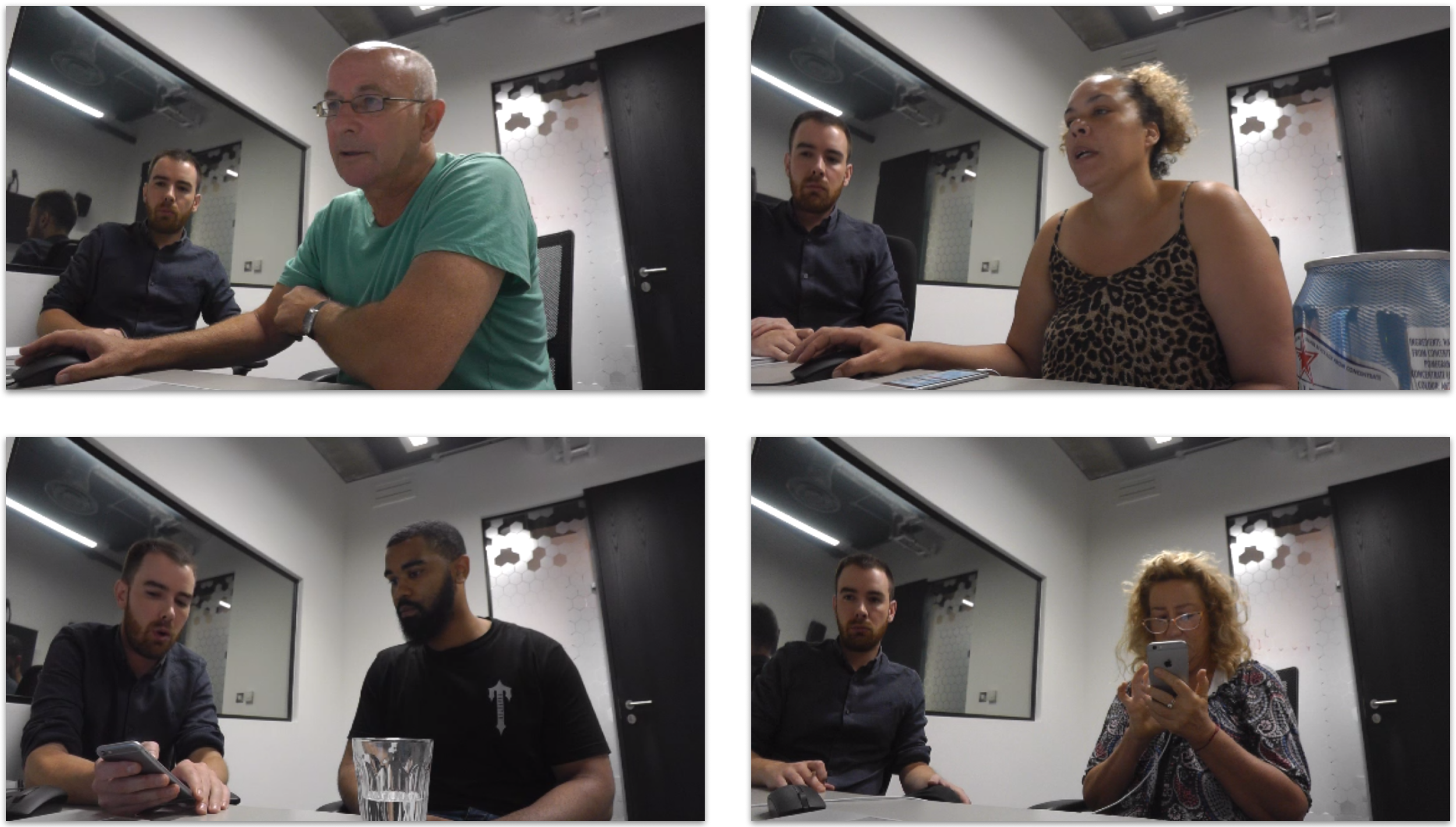
To get initial feedback on the variations of the wireframes, a colleague and I recruited five participants who were unfamiliar with the BHF and conducted individual 45 minute usability testing sessions on 6/10/17. All prototypes had both a desktop and mobile version.
Findings from these tests convinced me to make the following amendments:
- The 'related items' component was reduced in width. Participants appeared to confuse the full-width variation with the bottom of the page and therefore did not fully engage with the component.
- 'Mobile layout Version 1' was scrapped. The design used a secondary navigation positioned at the bottom of the page and many users missed it entirely.
- The styling of the drop-down menu from 'Mobile layout Version 2' was amended as some users noted that they hadn't noticed it initially.
- Consistent user feedback convinced us to change the ordering of the final components from body copy, secondary navigation, social sharing, related content, footer to body copy, related content, social sharing, footer.
Set 2 - 'Standard Content Page' visual designs
For the next set of testing sessions we showed participants some initial visual designs of the 'Standard Content Page'. This time we wanted to get feedback on layout, typography, imagery & colours and see how the amendments from session 1 performed. Six 45 minute user testing sessions were conducted by myself and a colleague in London on 26/10/17. Three participants were warm to the BHF and three were cool or cold.
Findings from these tests convinced me to make the following amendments:
- A version of the 'related items' component that used no imagery was scrapped as the variation which included small preview images had much better feedback and higher engagement.
- The title displayed in the 'Secondary nav' component was changed to 'Other pages in this section'. Initially the title had been contextual, changing to signpost the parent section of the currently selected page - this however proved to be confusing for users and the design was changed to provide more consistency.
- On mobile the secondary nav dropdown was changed from red to grey as the initial version had been somewhat camouflaged when placed next to the red header.
- The +/- buttons denoting 'open/close' on the nav dropdown proved confusing to some users and they were changed to 'up' and 'down' chevron icons.
- The subpages found on the secondary nav were more effectively indented.
Brand redesign
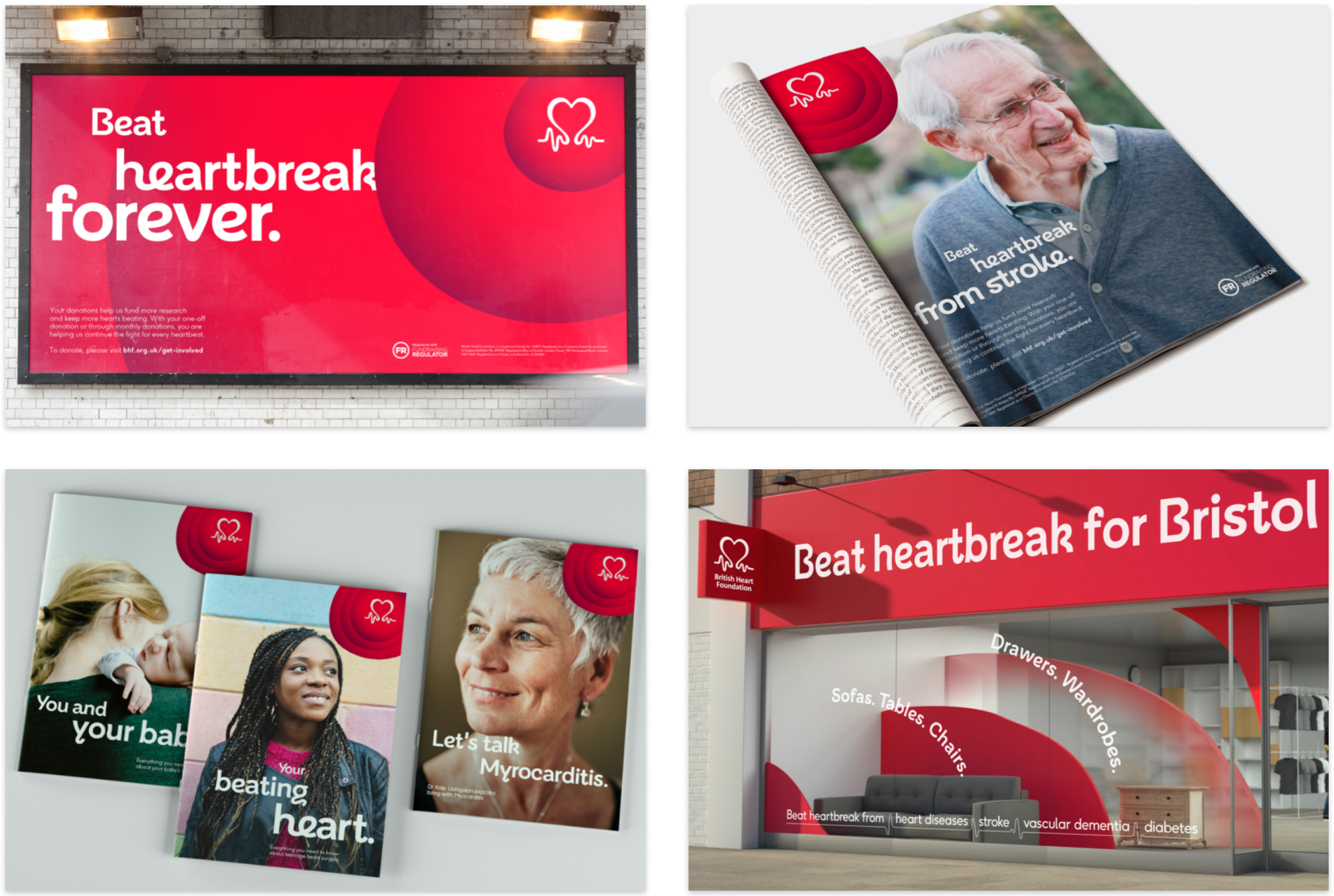
Midway through the initial design phase a complete BHF brand redesign was delivered by the agency Wolff Olins. This meant that the relaunched site would now need to have a completely new look and feel to coincide with the overall brand redesign launch later that year.
Wolff Olins' brand proposition posed a real challenge to me and my team because curves were a fundamental element to their design. I knew that without the ability to digitally repeat this element we would not be able to properly reflect the new brand proposition on the site. As such, a significant amount of time was needed to create such unconventional visual designs and ensure they would adapt across each breakpoint of the fully responsive site.
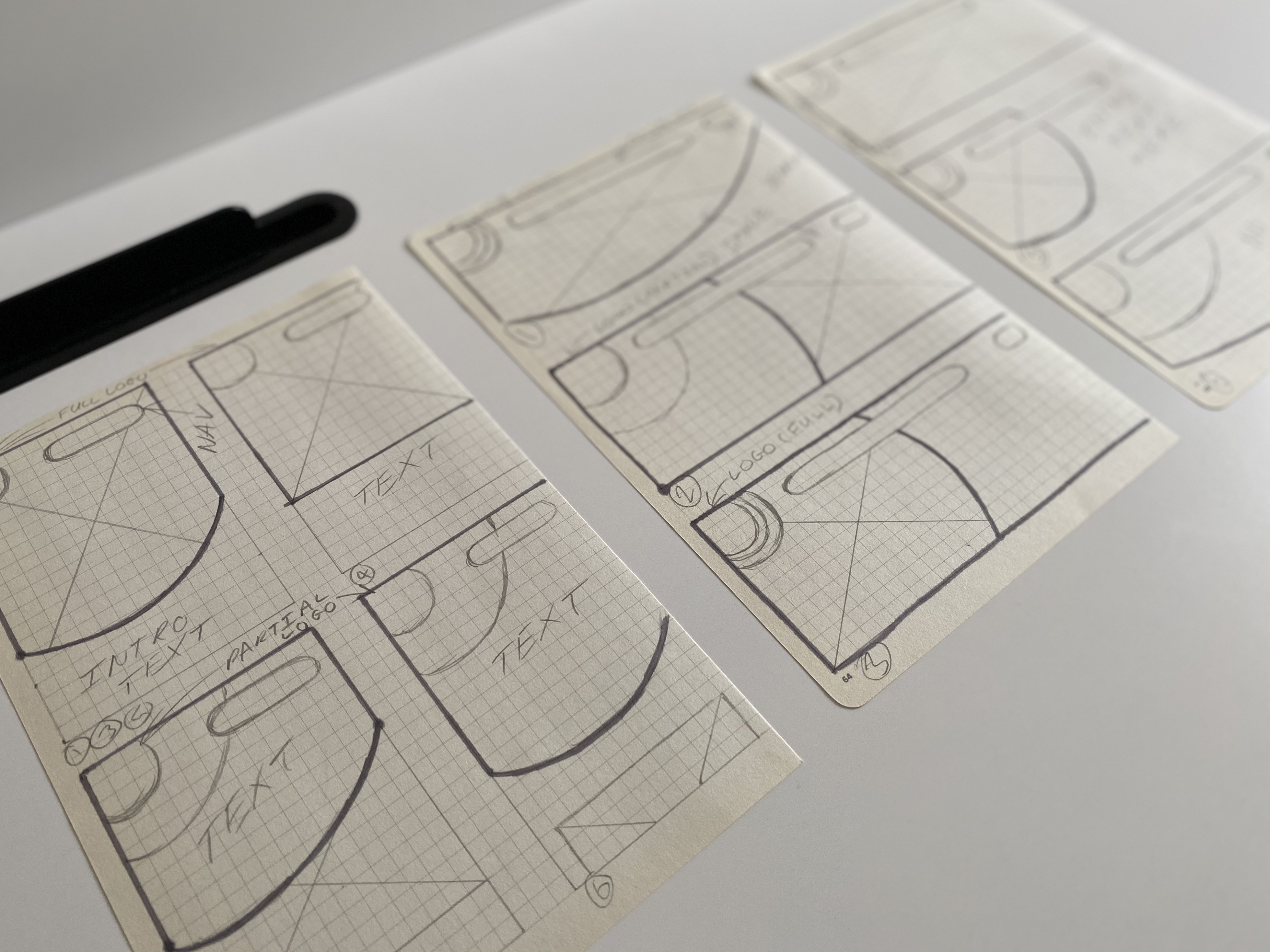
Early sketches exploring how the curved brand motif could adapt across layouts
Testing round 2 - New brand designs
Session 1 - Landing Page
After the 'Standard Content Page' design had been updated and designs for a new 'Landing Page' for the section 'What You Can Do' had been created we tested the pages once again. We conducted six 45 minute user testing sessions in London on 15/11/17. Three participants were warm to the BHF and three were cold or cool to the BHF. This time we also requested that participants had some experience raising money for a charity as the content of the created pages was related to fundraising.
Findings from these tests convinced me to make the following amendments:
- The 'Landing page' layouts we tested — neither version proved particularly successful in the testing. The navigational items were deemed to be 'hidden' on Version 1 and 'split up' on Version 2.
- The secondary nav's 'currently selected page' was amended to make the element more visually clear.
- We took the decision to remove breadcrumbs at the mobile breakpoint as engagement was very low and their presence was detracting from other elements of the design.
Session 2 - Homepage, Landing page and Standard Content Page journeys
We conducted six 45 minute user testing sessions on 1/12/17 in Birmingham, this time focusing on more developed journeys between the 'Homepage', 'Landing Page' and 'Standard Content Page'. Three participants were warm to the BHF and three were cold or cool to the BHF. Again, all had some experience of fundraising for charity.
Findings from these tests convinced me to make the following amendments:
- The depth of the header was reduced on mobile to avoid the 'wall of red' created by the previous design.
- Links were added to each navigational block's image and subheader as well as the button.
- Buttons with the title 'Learn more' were each given different titles to better adhere to their area of access.
- A proposed image carousel component was scrapped due to low engagement.
Merging the old and new
The tight deadline to coincide with the new brand launch meant that we were only able to fully redesign select high-profile pages of the site. This meant that I was faced with the challenge of communicating the same revamped design across a site made up of both new and old page styles. To give a sense of continuity across all pages I created a new universal footer and two variants of a new header that would be suitable for use whether the page was old or new. All fonts and colours across the old pages were also updated to bring their look in line with the redesigned pages.
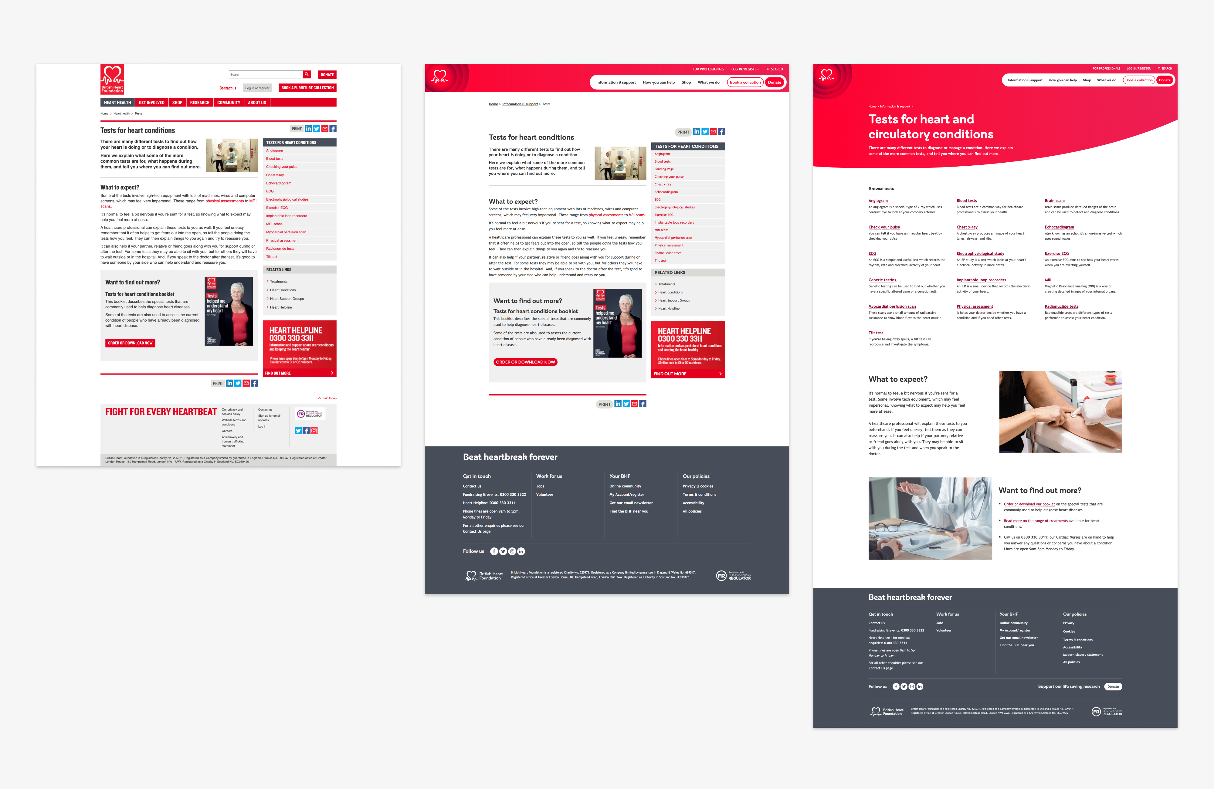
Old and new versions of a site page
Post launch testing
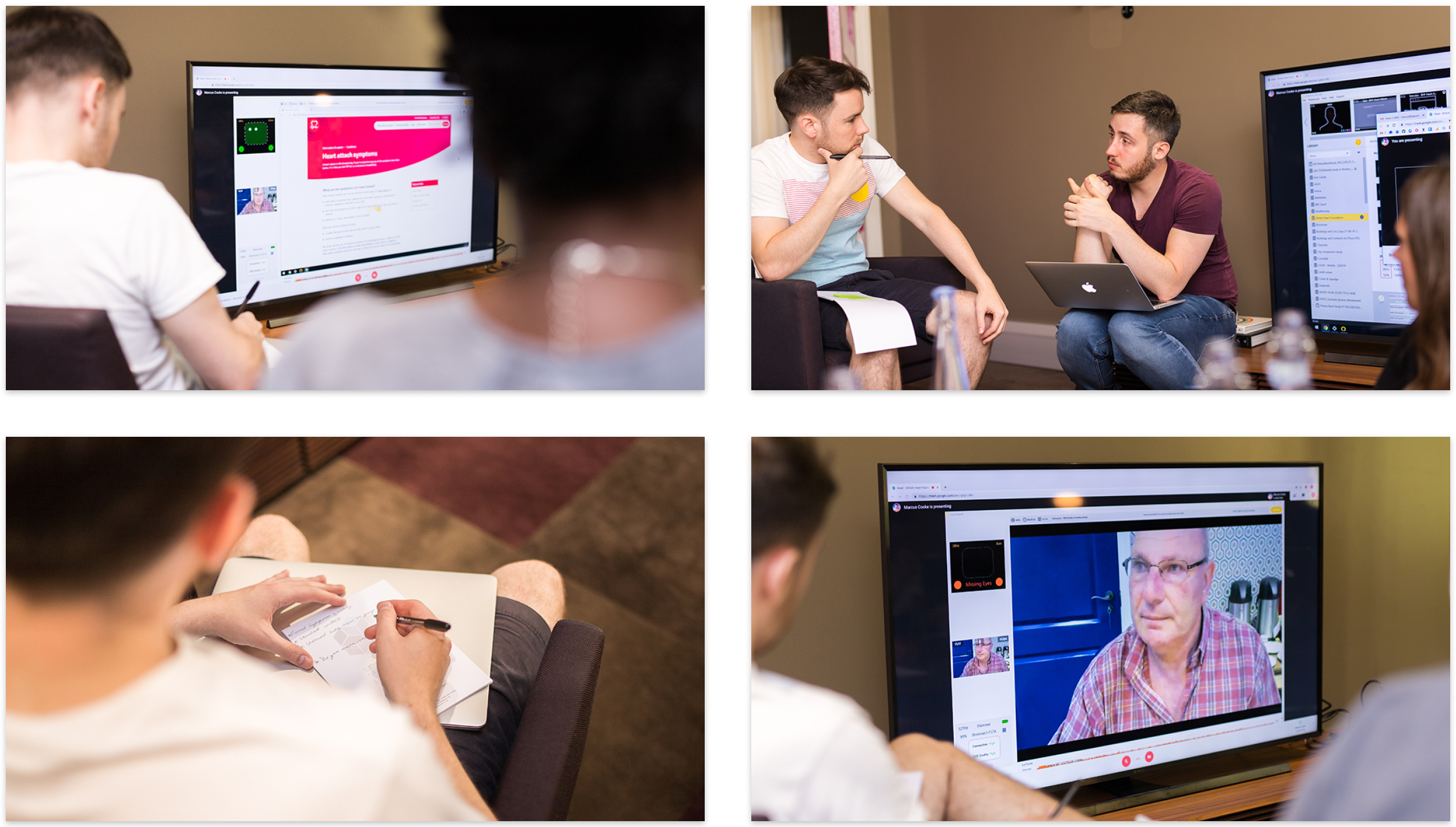
After the site was launched we conducted five 1 hour user testing sessions on 29/7/18 in London. The users were a mix of charity volunteers and participants with lived cardiovascular disease. We tested three page journeys in prototype form - 'Volunteer', 'Tests' and 'Furniture & Electrical' as well as elements of the live site, all were tested at desktop and mobile sizes.
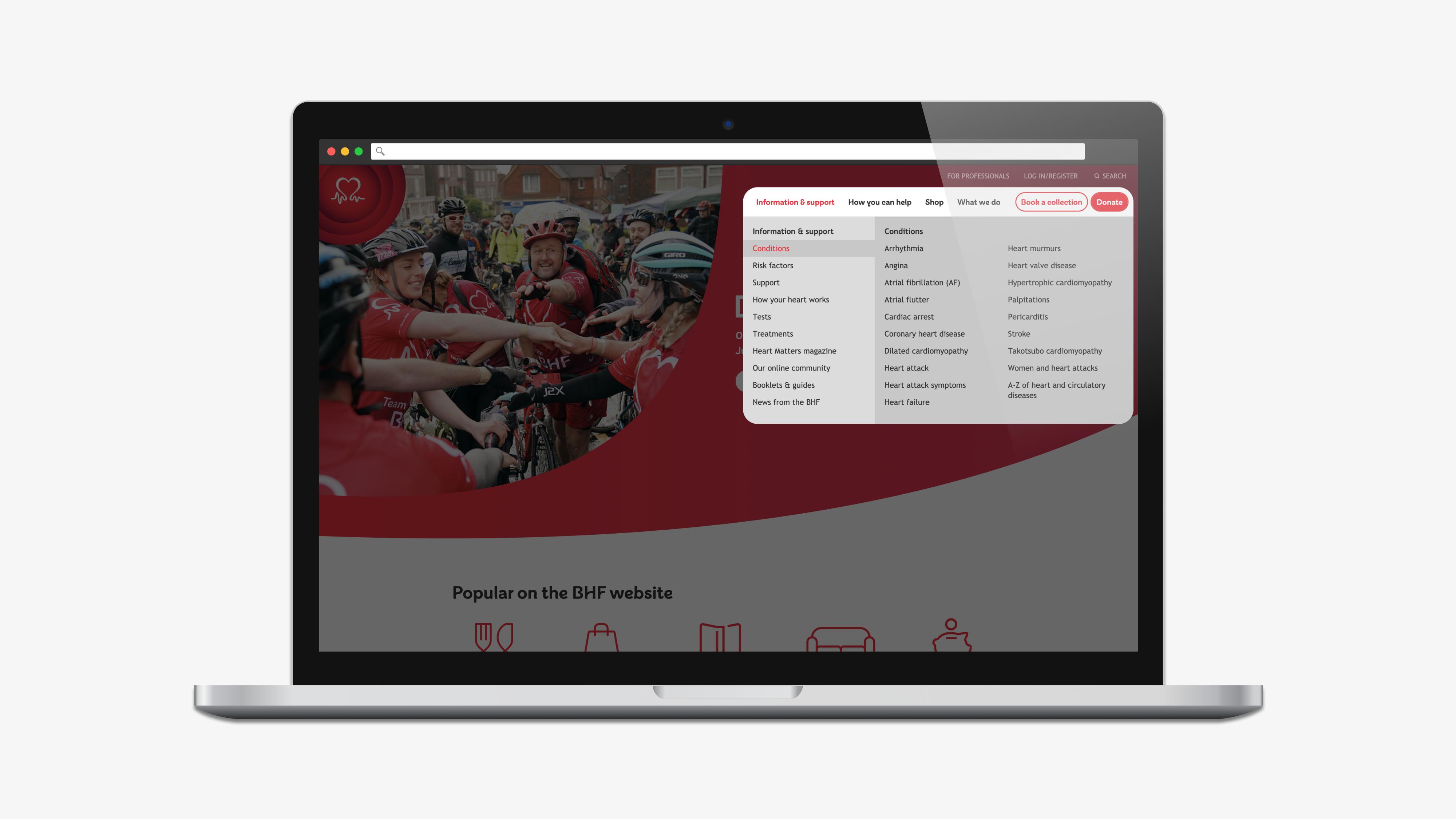
Testing with the newly live site meant that we were able to task the users with the fully developed mega-nav menu. We observed that the majority of participants were able to use the mega-nav to quickly navigate to the 'Volunteer' and 'ECG' pages from the homepage. Users said that they found the mega-nav useful because it was "easy to see a lot at once" with "less clicking around". When prompted again on the volunteer page two users opted to use the search bar instead of using the mega-nav, however when they were asked to find an alternative to the search bar they were also able to use the menu successfully. The mobile version of the menu performed particularly well and none of the participants had any issues successfully navigating through the page levels.
Forms
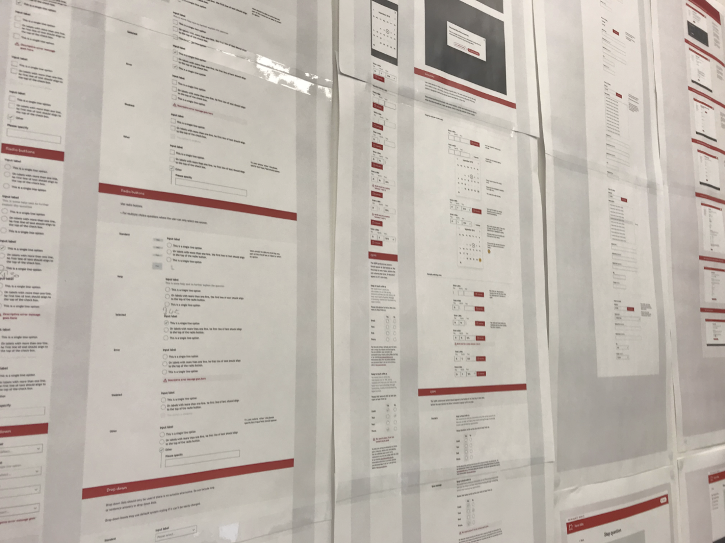
The form pages of the site were also redesigned and a comprehensive set of guidelines were created to inform content creators on how to create best practice forms.
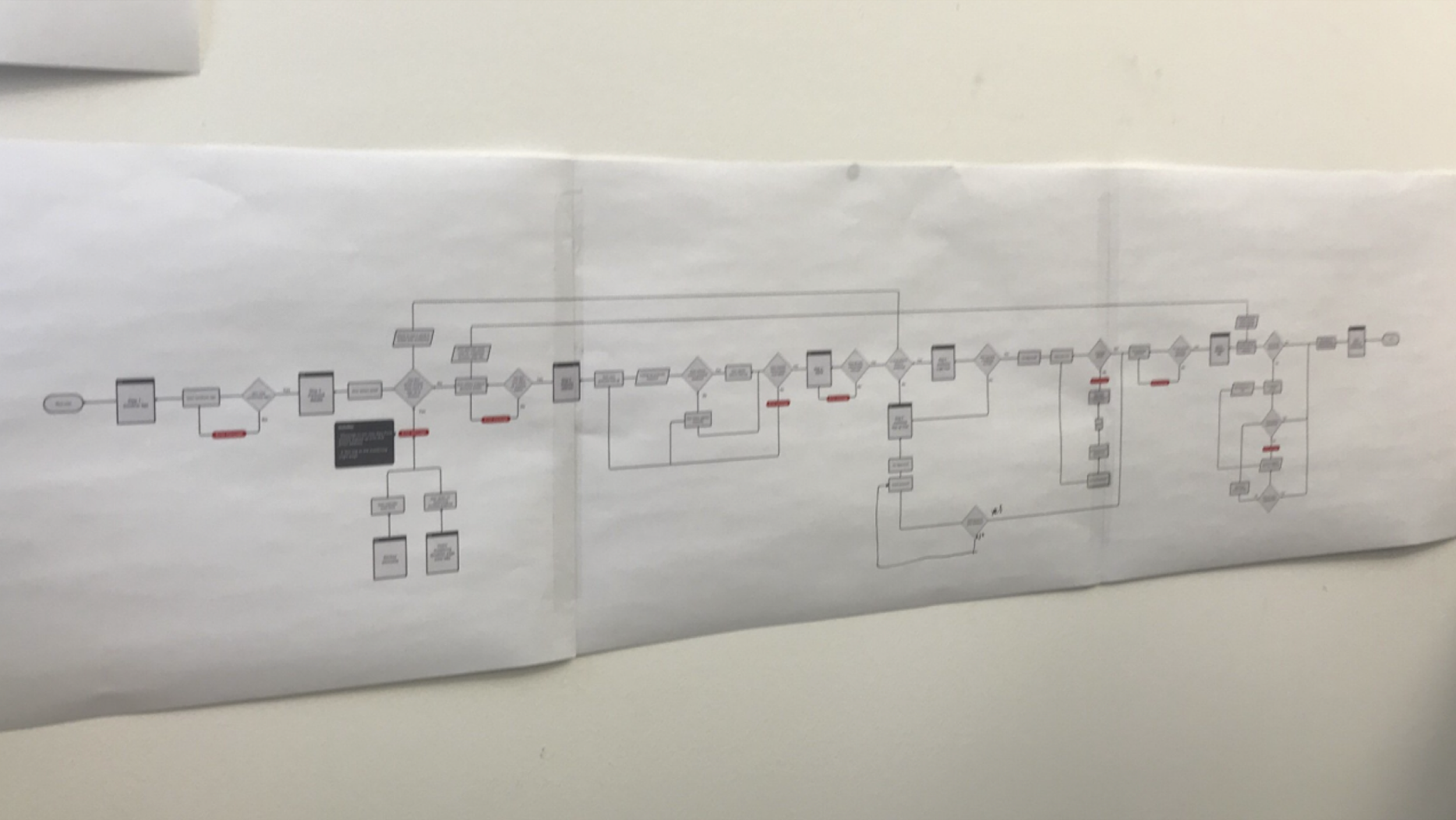
Each of the relaunched forms have been split out over multiple pages to decrease the number of visible questions and increase focus from the user. Other new features added to the forms include:
- Address look-up with autocomplete functionality
- A calendar to be used with date entry fields
- Optional help text for individual fields
- Highlighting of the current input field
- Instant styling changes for positively and negatively validated fields
- Expanding fields for potentially long text
User feedback gathered via survey was unanimously favourable and the months following the relaunch saw an uplift in event, donation and collection conversions against the average from the previous year.
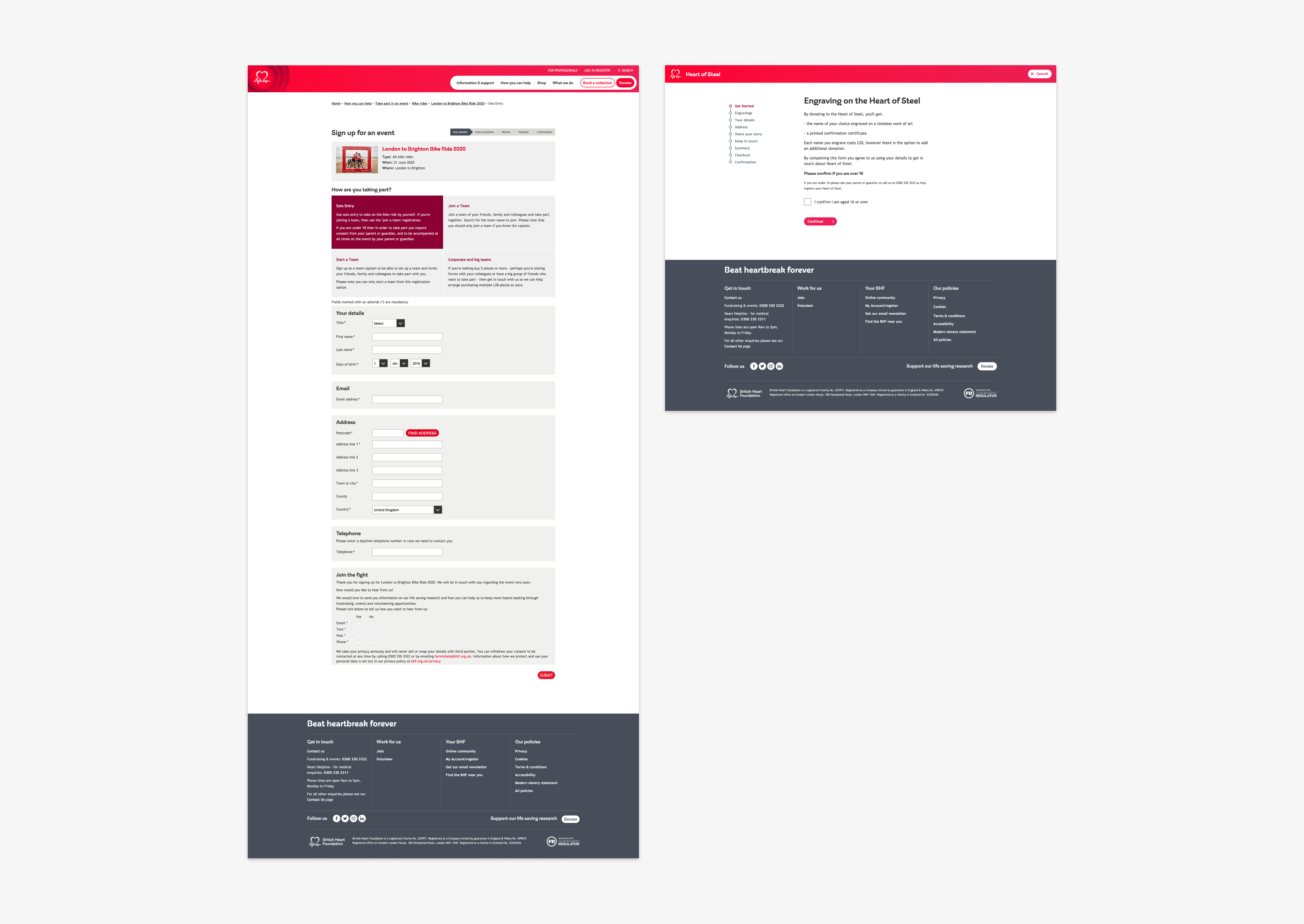
Original and redesigned forms
Big Beat Hub
Alongside the redesign, a site called the 'Big Beat Hub' was created by an external team. This cloud based platform houses all of the brand's assets, guidelines & photography and serves as a living style guide to be used by the UX team and our external contributors. I worked with the agency to style this white-label product and members of my team supplied all the material regarding constructing pages and creating new components for bhf.org.uk.
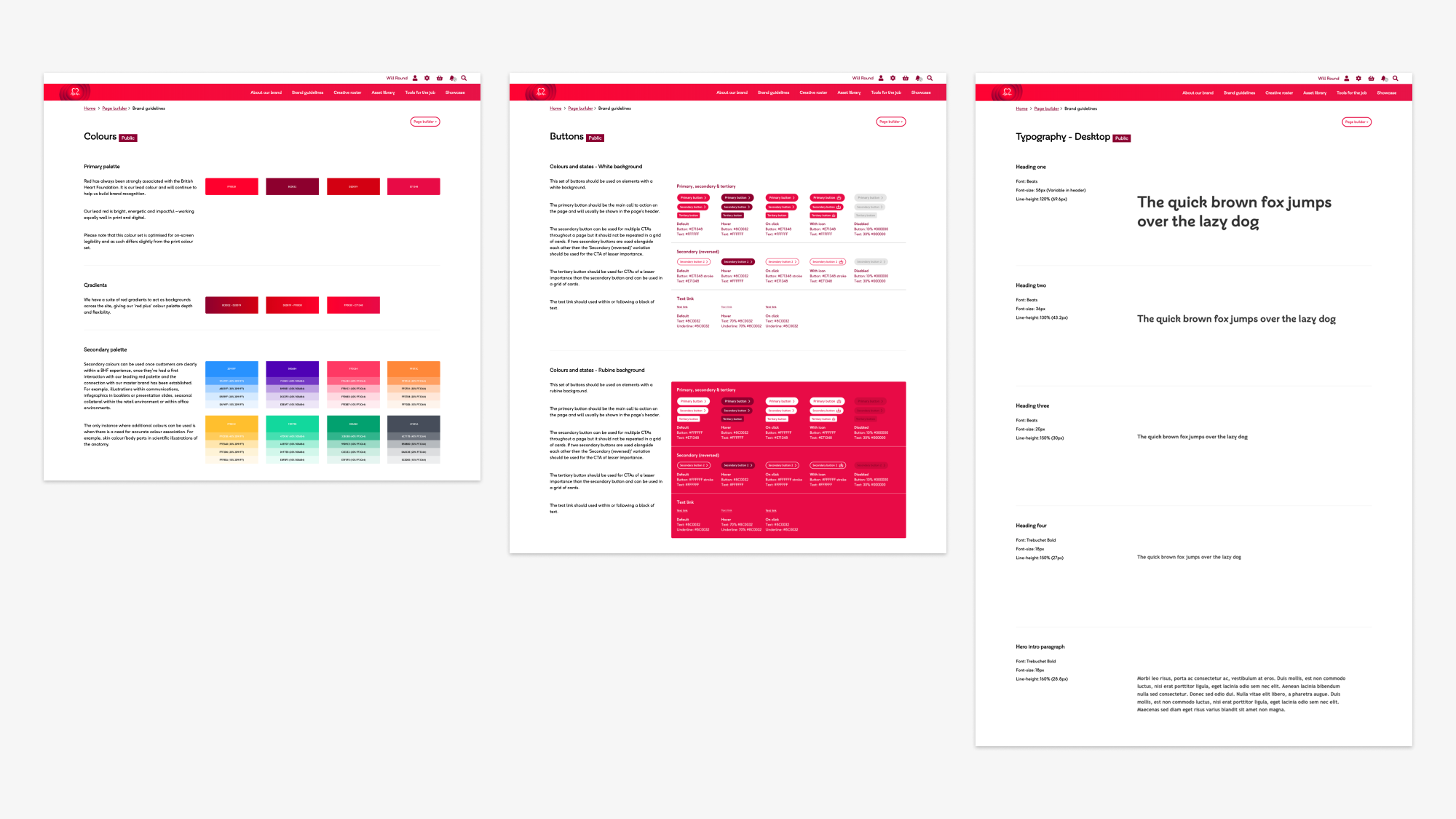
Example pages from the Big Beat Hub
Final designs
Navigation
The introduction of a refined hierarchy and more intuitively labelled content means that users should now be able to engage with the site with less friction. The creation of a new mega-nav also allows each user to quickly find their chosen page with less navigation.
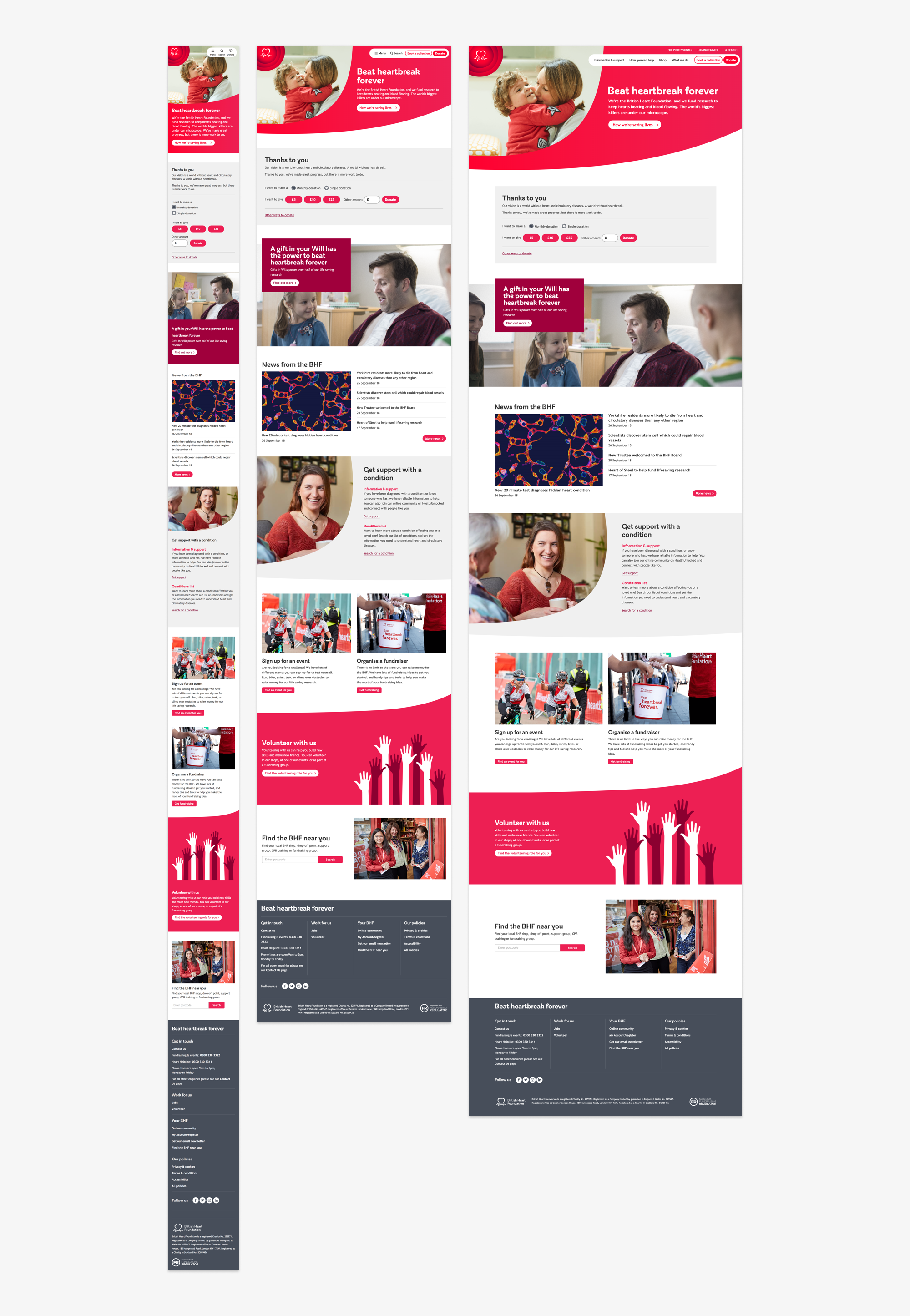
Homepage
Our organic curved look sets us apart from other charity sites and brings a humanity and warmth to our message.
Landing page
The introduction of micro interactions and animation have been included to delight users and keep bringing them back to the site.
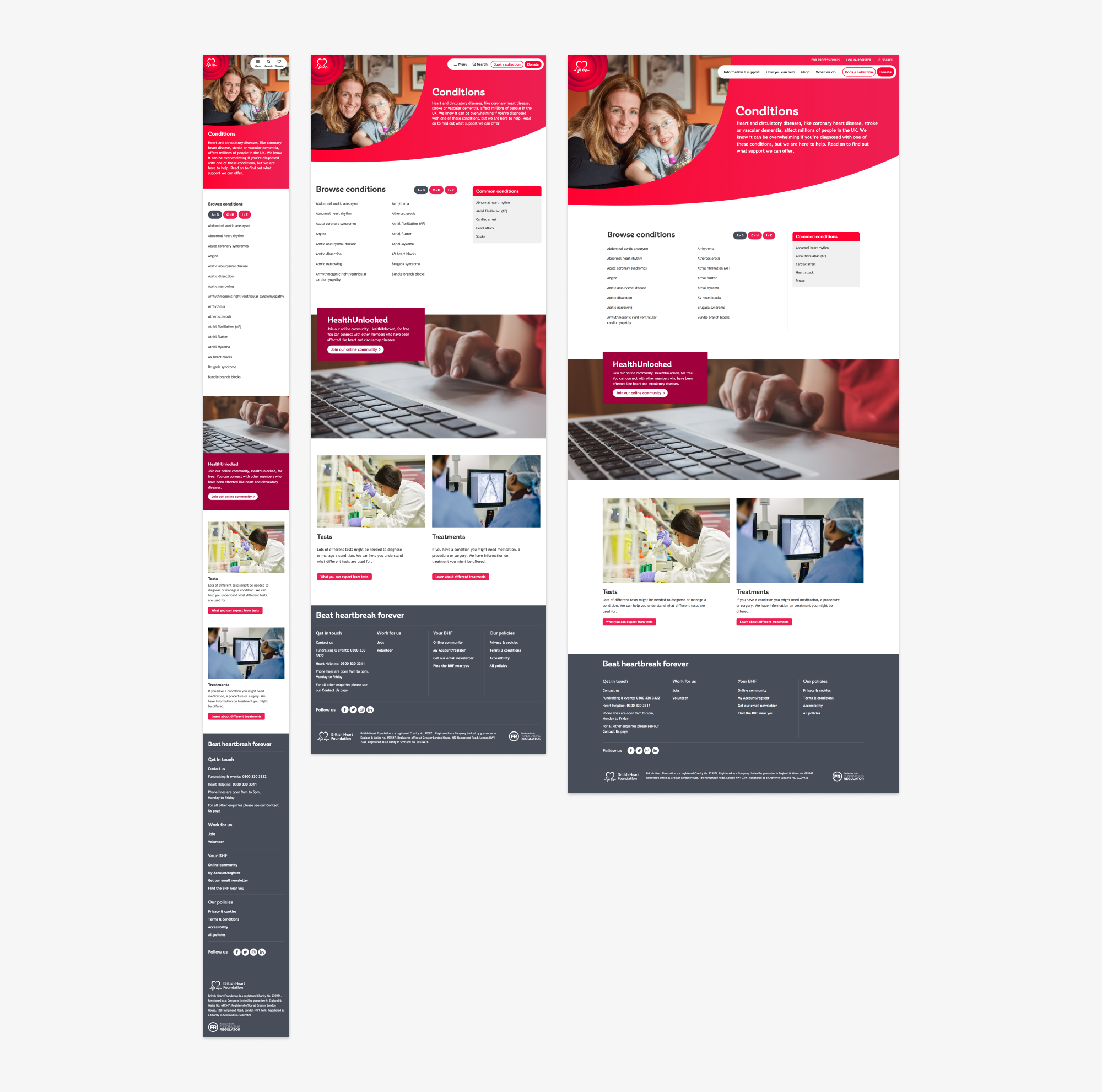
Standard content page
Finally, the site is now fully responsive and provides users with the same rich experience regardless of their device.